
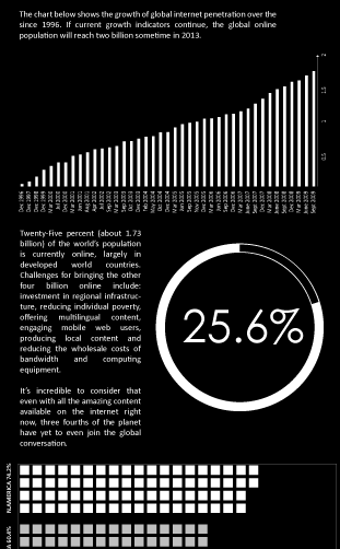
Twenty-Five percent (about 1.73 billion) of the world’s population is currently online, largely in developed world countries. Challenges for bringing the other four billion online include: investment in regional infrastructure, reducing individual poverty, offering multilingual content, engaging mobile web users, producing local content and reducing the wholesale costs of bandwidth and computing equipment. It’s incredible to consider that even with all the amazing content available on the internet right now, three fourths of the planet have yet to even join the global conversation. The above graphic illustrates how far we’ve come as well as how far we still have to go.
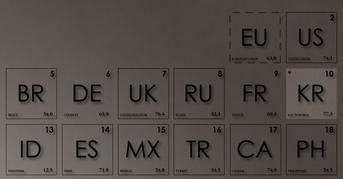
High quality prints are available in our shop while a massive 4608×3454 highres can be found here. For a detailed close up on each section of the graphic, click here. Free downloads (without watermarks) are available here (normal) and here (as black and white). This type of data is very hard to keep accurate for longer than a few months (sometimes even weeks) so it will be updated every quarter with the latest information available. The graphic displays all the country-codes of the world as the blocks of a periodic table. They are ranked by the number of users in each country made from the list I found here on Wikipedia but there’s much more detail when you look closer.
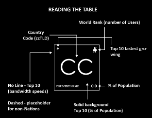
Reading the Table
Each block contains up to eight pieces of information. The rank (and sequential order of the chart), place among the top ten fastest growing internet populations, the country code (also the countries ccTLD), rank among the countries with the fastest bandwidth speeds, percentage of population using the internet, the country name, and in some cases whether or not the block represents a country or territory.
In addition, there is a block that shows the Top Ten countries of various categories…
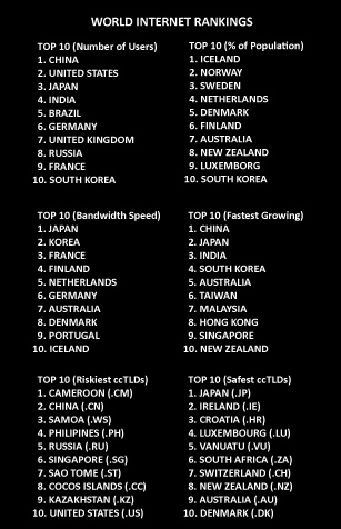
All of this data is reflected in the table as well. In the case of the Safest and Riskiest domains, that can be found in the text at the bottom left of the image.
Three charts to the right display the world’s current internet penetration, penetration by region and growth from 1995 to now.
If you are looking for more info graphics related to global development, check out our infographic category.
List of sources: OECD Broadband Portal, Comscore INC., Wikipedia, InternetWorldStats.com, IDC, CI Almanac, Nua Ltd., McAffe Mapping the Mal Web, IANA, ICANN, W3C, World Broadband Statistics Report (Point Topic), Forrester Research Group.
Image Edits
Last Updated Dec 13, 2009.

About the author: Jonathan Gosier is a UI designer, software developer and writer. He currently lives in Kampala, Uganda where he incubates and invests in East African entrepreneurs as the CEO of Appfrica Labs. He's also a TED Fellow.
. Bookmark the
permalink. Trackbacks are closed, but you can .


Periodic Table of World Internet Facts
Twenty-Five percent (about 1.73 billion) of the world’s population is currently online, largely in developed world countries. Challenges for bringing the other four billion online include: investment in regional infrastructure, reducing individual poverty, offering multilingual content, engaging mobile web users, producing local content and reducing the wholesale costs of bandwidth and computing equipment. It’s incredible to consider that even with all the amazing content available on the internet right now, three fourths of the planet have yet to even join the global conversation. The above graphic illustrates how far we’ve come as well as how far we still have to go.
High quality prints are available in our shop while a massive 4608×3454 highres can be found here. For a detailed close up on each section of the graphic, click here. Free downloads (without watermarks) are available here (normal) and here (as black and white). This type of data is very hard to keep accurate for longer than a few months (sometimes even weeks) so it will be updated every quarter with the latest information available. The graphic displays all the country-codes of the world as the blocks of a periodic table. They are ranked by the number of users in each country made from the list I found here on Wikipedia but there’s much more detail when you look closer.
Reading the Table
Each block contains up to eight pieces of information. The rank (and sequential order of the chart), place among the top ten fastest growing internet populations, the country code (also the countries ccTLD), rank among the countries with the fastest bandwidth speeds, percentage of population using the internet, the country name, and in some cases whether or not the block represents a country or territory.
In addition, there is a block that shows the Top Ten countries of various categories…
All of this data is reflected in the table as well. In the case of the Safest and Riskiest domains, that can be found in the text at the bottom left of the image.
Three charts to the right display the world’s current internet penetration, penetration by region and growth from 1995 to now.
If you are looking for more info graphics related to global development, check out our infographic category.
List of sources: OECD Broadband Portal, Comscore INC., Wikipedia, InternetWorldStats.com, IDC, CI Almanac, Nua Ltd., McAffe Mapping the Mal Web, IANA, ICANN, W3C, World Broadband Statistics Report (Point Topic), Forrester Research Group.
Image Edits
Last Updated Dec 13, 2009.